Report Dashboard for VolCafe
Client: VolCafe (via Watson Creative)
Services: Custom WordPress Plugin Development, API Integration, Data Visualization
Industry: Agriculture / Coffee Supply Chain
The Challenge
VolCafe's field agents were already capturing valuable data about coffee growers worldwide using TrackVia—but that data wasn't reaching decision-makers effectively.
The reporting process was entirely manual:
- Staff exported data from TrackVia into spreadsheets
- Visualizations were created offline in Excel, one report at a time
- There was no centralized dashboard—stakeholders across regions worked from disconnected snapshots
- Regional access controls were handled informally, creating compliance and confidentiality risks
Leadership needed a way to transform raw field data into actionable insights—automatically, securely, and in real time.
The Solution
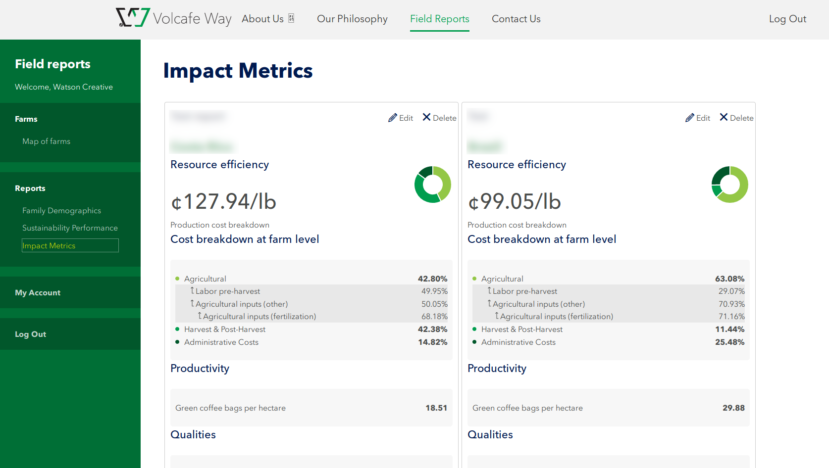
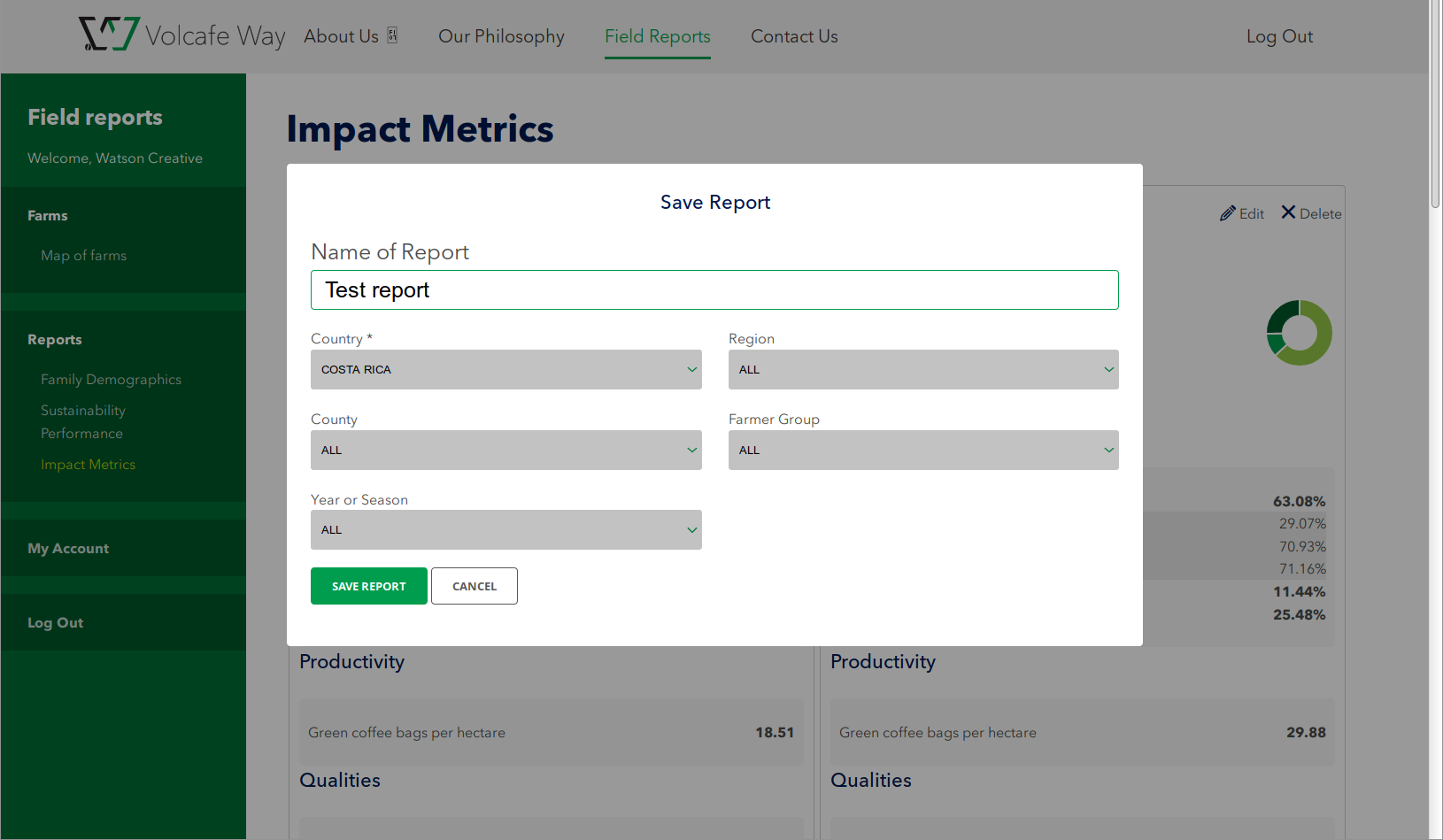
We developed a custom WordPress plugin that pulls data directly from TrackVia and presents it through an interactive, permission-controlled dashboard.
Automated Data Pipeline
Weekly synchronization with the TrackVia API replaced manual exports entirely. Using WP-CLI and scheduled CRON jobs, the system keeps the dashboard current without human intervention.
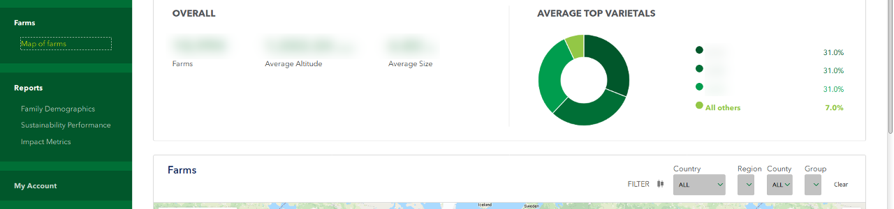
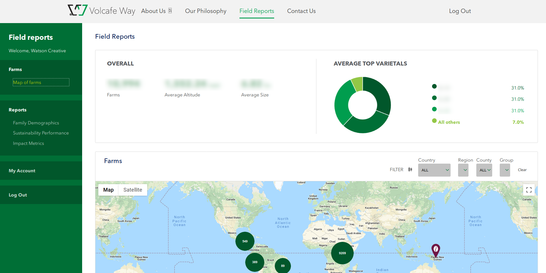
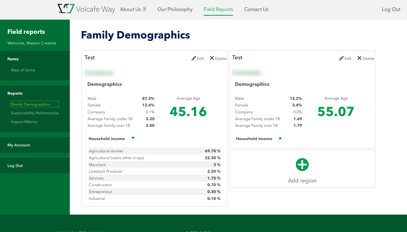
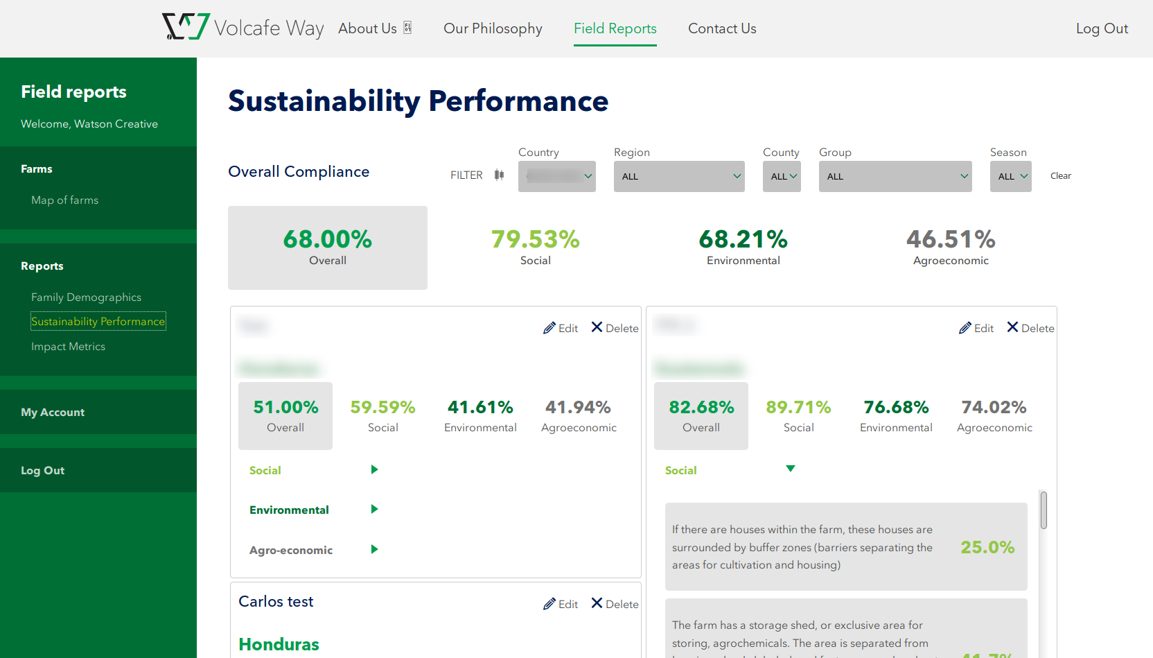
Interactive Visualizations
Stakeholders explore demographic, environmental, and financial metrics through dynamic charts and geographic cluster markers on Google Maps—no more static spreadsheet graphs.
Granular Access Control
Site administrators manage user permissions down to the county level, ensuring regional managers see only the territories they're authorized to access. This formalized what had previously been an informal, error-prone process.
Technical Approach
| Component | Implementation |
|---|---|
| Architecture | Object-oriented PHP WordPress plugin |
| Data Source | RESTful integration with TrackVia API |
| Synchronization | Automated weekly sync via WP-CLI + CRON |
| Visualization | Google Maps API, dynamic charting libraries |
| Access Control | Role-based permissions with county-level granularity |
The Impact
While specific metrics remain confidential, the transformation was significant:
- From manual to automatic: Eliminated recurring data export and spreadsheet preparation work
- From fragmented to centralized: Single source of truth accessible to authorized stakeholders worldwide
- From static to interactive: Self-service exploration replaced one-off report requests
- From informal to controlled: Documented, auditable access permissions replaced ad-hoc data sharing
Partnership
Watson Creative provided UX design and project specifications. Rational Boxes handled all technical architecture, development, and API integration.
Screenshots
Facing similar challenges with disconnected data and manual reporting?
Let's talk about automating your insights →